A Tube map of
London house prices
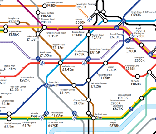
London house prices
Published on September 2, 2024
London's housing market can be rough. Prices are high everywhere, making it a massive challenge to find a neighbourhood even remotely in budget.
So we've repurposed a Tube map to guide you through the madness. It shows the average property price within one kilometre of each station on the TfL network. We've calculated the average price in the year to August 2024 as well as the four years before.
Start exploring the map in your browser using the button below.
This isn't our only housing Tube map. In June, we published a Tube map of London rents, showing how much a one-bed costs per month near each station.
You can check it out — and support our work — using the button below.